Salesforce CMS Project
Design
Dev
Application Portal
How a dynamic dashboard redesign streamlined the University of Alaska Fairbanks (UAF) application process. I leveraged front-end design and complex CMS logic to transform a cluttered, static portal into a personalized journey, resolving critical maintenance issues for staff and clarifying the path for 10,000+ applicants.
Role :
Product Designer, Product Manager, Dev
Impact :
43% ↑ Completed Apps
Methodologies :
Iterative Testing, User Segmentation, Design Systems
Project Duration :
8 Weeks
context & constraints
The portal was suffering from a high drop-off rate
UAF needed to overhaul its application portal to decrease drop-off rates and streamline back-end processing. The existing system was a static, "one-size-fits-all" dashboard shared by three universities.
The "No-Code" Trap
The portal relied on a rigid shared CMS with no API access. Customization was limited to configuring existing "widgets" and styling them with CSS.
Shared Environment
We shared the codebase with two other universities. Any oversight in global widgets risked breaking their portals, creating a high-stakes environment where errors could cause system-wide outages.
Limited User Testing
The project timeline ran over the summer, significantly limiting access to a large student testing pool.
So How Might We…
Transform a static, cluttered dashboard into a dynamic roadmap that proactively guides students to their next step?
research & discovery
design Audit
to understand the friction in the application cycle, I evaluated the current interface and identified a few visual and functional opportunities of interest.
visually overwhelming
leading to a confusing experience

dead-end checklist
doesn't have any links or offer any explanations on what to do


very text heavy
wordy displays aren't always relevant to the student

staff suffered from operational Bottlenecks
Repetitive Questions
Like ("How do I send my transcript?") because the portal offered no explanations.
Process Redundancy
Overcompensated with manual emails and calls, doubling the time to process applications.
Widget Maintenance
Maintaining 10 different widgets made the back end difficult to navigate and prone to breaking.
students suffered dead ends & Confusion
A Dead-End Checklist
Provided no instructions or links on how to submit incomplete or missing documents. This forced students to stop applying or email support for basic instructions.
Content Overload & Visual Noise
The dashboard was filled with generic university news, unrelated decorative images, and links that didn't apply to most users. This excess information buried the actual application tasks.
Unclear Next Steps
Students reported getting lost in the clutter, unable to find the "Start" button or identify their next step amidst the noise, leading to high drop-off rates at the transition point.
THe sYSTEM FAILED BECAuse…
It treated every user the same. To solve the staff's support burden and the student's confusion,
the portal needed to filter information and provide actionable next steps, not just list missing items.
Ideation & stategy
DEcoupling the BACK end
The root cause of our rigidity was the Shared Widget model. All three universities were sharing 10 of the 16 available widgets, meaning any change I made to a "Global" widget risked breaking the portal for the other two campuses.
I analyzed the CMS architecture and identified that Widgets 1–10 were shared, but Widgets 11–16 were largely dormant or inconsistent.
CURRENT WIDGET ALLOCATION
PROPOSED WIDGET ALLOCATION
SHARED
UNUSED
UNI 1
uni 3
UNI 2
General
This created separated environments
So we could run complex logic and radical design changes on Widgets 11–16 without touching the shared code in 1–10.
I delivered documentation advising the partner universities to decouple Widgets 1–10 and create their own dedicated instances in the future.
DEAd-end CheckLIst
Listed errors and missing documents but gave no instructions.
rigid cMS
I couldn't directly edit the checklist and add embedded links
"NEXT sTEPS" PAGE
a custom page that contained exact instructions for a user's missing items.
dynamic content
I configured the CMS to pass user tags (e.g., "Veteran") to this page, ensuring information was timely and relevant.
The "Next Steps" Workaround
Final SOLUTION
I launched a dynamic dashboard…
that adapts in real-time to the student's journey, powered by our new UAF-Exclusive widget architecture.
Prospect / Inquiry View
for people who haven't applied yet or are returning students. The main goal is to get users to start their application or talk to someone if they'd like.
Problem Solved: cognitive load
By reducing distractions, we removed the barrier to entry for new users.

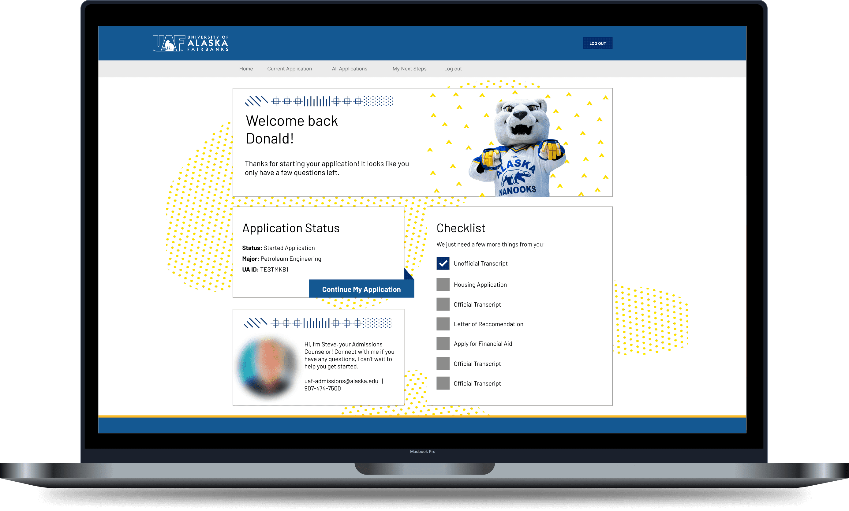
Current applicant view
for people who have started the application process. The main goal is to help and encourage them to finish applying.
Problem Solved: clear flow & instructions
User clear instructions on what to do and list of missing items. Decluttered UI allows for easier navigation.
MY NEXT STEPS Page
The out-of-the-box checklist widget was uneditable and it listed errors but gave no instructions.
So I configured the CMS to pass user tags to a dedicated custom page linked from the dashboard.
Problem Solved: critical information
If a user is tagged as Military, the page dynamically renders the "GI Bill Upload" guide. If not, that section is hidden.

side-by-side comparison
OLD Dashboard

NEw dashboard

impact & Results
+43% Growth
We achieved a 43% year-over-year increase in completed applications.
result
The new dashboard reduced the initial friction and drop-off points.
0% dependency
By migrating UAF logic to the previously dormant Widgets 11–16, I decoupled our environment from the other two universities.
result
This eliminated the risk of accidents caused by shared global updates, stabilizing the platform for all three campuses.
-20% Tickets
Staff reported a drastic drop in application related calls and emails
REsult
Staff can focus more on outreach and application processing.
Reflection & Key Takeaways
This project was a significant learning experience in how technical constraints can actually drive better design decisions.
The Value of Technical Context
I learned that you can't fix the user experience without addressing the administrator's experience. By solving the "Widget Bloat" problem for the staff, we naturally cleared the path for the students. It changed how I view "back-of-house" problems, they are rarely just operational; they are almost always UX issues in disguise.
Internal Chaos Creates External Friction
I learned that you can't fix the user experience without addressing the administrator's experience. By solving the "Widget Bloat" problem for the staff, we naturally cleared the path for the students. It changed how I view "back-of-house" problems—they are rarely just operational; they are almost always UX issues in disguise.
Restraint is a Design Tool
The biggest lesson for me was learning to subtract. The success of the dashboard didn't come from adding flashy new features, but from the discipline to hide 60% of the content until it was relevant. It taught me that sometimes the most helpful thing a designer can do is simply remove the noise.
Salesforce CMS Project
Design
Dev
Application Portal
How a dynamic dashboard redesign streamlined the University of Alaska Fairbanks (UAF) application process. I leveraged front-end design and complex CMS logic to transform a cluttered, static portal into a personalized journey, resolving critical maintenance issues for staff and clarifying the path for 10,000+ applicants.
Role :
Product Designer, Product Manager, Dev
Impact :
43% ↑ Completed Apps
Methodologies :
Iterative Testing, User Segmentation, Design Systems
Project Duration :
8 Weeks
context & constraints
The portal was suffering from a high drop-off rate
UAF needed to overhaul its application portal to decrease drop-off rates and streamline back-end processing. The existing system was a static, "one-size-fits-all" dashboard shared by three universities.
The "No-Code" Trap
The portal relied on a rigid shared CMS with no API access. Customization was limited to configuring existing "widgets" and styling them with CSS.
Shared Environment
We shared the codebase with two other universities. Any oversight in global widgets risked breaking their portals, creating a high-stakes environment where errors could cause system-wide outages.
Limited User Testing
The project timeline ran over the summer, significantly limiting access to a large student testing pool.
The "No-Code" Trap
The portal relied on a rigid shared CMS with no API access. Customization was limited to configuring existing "widgets" and styling them with CSS.
Shared Environment
We shared the codebase with two other universities. Any oversight in global widgets risked breaking their portals, creating a high-stakes environment where errors could cause system-wide outages.
Limited User Testing
The project timeline ran over the summer, significantly limiting access to a large student testing pool.
The "No-Code" Trap
The portal relied on a rigid shared CMS with no API access. Customization was limited to configuring existing "widgets" and styling them with CSS.
Shared Environment
We shared the codebase with two other universities. Any oversight in global widgets risked breaking their portals, creating a high-stakes environment where errors could cause system-wide outages.
Limited User Testing
The project timeline ran over the summer, significantly limiting access to a large student testing pool.
So How Might We…
Transform a static, cluttered dashboard into a dynamic roadmap that proactively guides students to their next step?
research & discovery
design Audit
to understand the friction in the application cycle, I evaluated the current interface and identified a few visual and functional opportunities of interest.
visually overwhelming
leading to a confusing experience
dead-end checklist
doesn't have any links or offer any explanations on what to do
very text heavy
wordy displays aren't always relevant to the student
staff suffered from operational Bottlenecks
Repetitive Questions
Like ("How do I send my transcript?") because the portal offered no explanations.
Process Redundancy
Overcompensated with manual emails and calls, doubling the time to process applications.
Widget Maintenance
Maintaining 10 different widgets made the back end difficult to navigate and prone to breaking.
Repetitive Questions
Like ("How do I send my transcript?") because the portal offered no explanations.
Process Redundancy
Overcompensated with manual emails and calls, doubling the time to process applications.
Widget Maintenance
Maintaining 10 different widgets made the back end difficult to navigate and prone to breaking.
Repetitive Questions
Like ("How do I send my transcript?") because the portal offered no explanations.
Process Redundancy
Overcompensated with manual emails and calls, doubling the time to process applications.
Widget Maintenance
Maintaining 10 different widgets made the back end difficult to navigate and prone to breaking.
students suffered dead ends & Confusion
A Dead-End Checklist
Provided no instructions or links on how to submit incomplete or missing documents. This forced students to stop applying or email support for basic instructions.
Content Overload & Visual Noise
The dashboard was filled with generic university news, unrelated decorative images, and links that didn't apply to most users. This excess information buried the actual application tasks.
Unclear Next Steps
Students reported getting lost in the clutter, unable to find the "Start" button or identify their next step amidst the noise, leading to high drop-off rates at the transition point.
A Dead-End Checklist
Provided no instructions or links on how to submit incomplete or missing documents. This forced students to stop applying or email support for basic instructions.
Content Overload & Visual Noise
The dashboard was filled with generic university news, unrelated decorative images, and links that didn't apply to most users. This excess information buried the actual application tasks.
Unclear Next Steps
Students reported getting lost in the clutter, unable to find the "Start" button or identify their next step amidst the noise, leading to high drop-off rates at the transition point.
A Dead-End Checklist
Provided no instructions or links on how to submit incomplete or missing documents. This forced students to stop applying or email support for basic instructions.
Content Overload & Visual Noise
The dashboard was filled with generic university news, unrelated decorative images, and links that didn't apply to most users. This excess information buried the actual application tasks.
Unclear Next Steps
Students reported getting lost in the clutter, unable to find the "Start" button or identify their next step amidst the noise, leading to high drop-off rates at the transition point.
THe sYSTEM FAILED BECAuse…
It treated every user the same. To solve the staff's support burden and the student's confusion,
the portal needed to filter information and provide actionable next steps, not just list missing items.
Ideation & stategy
DEcoupling the BACK end
The root cause of our rigidity was the Shared Widget model. All three universities were sharing 10 of the 16 available widgets, meaning any change I made to a "Global" widget risked breaking the portal for the other two campuses.
I analyzed the CMS architecture and identified that Widgets 1–10 were shared, but Widgets 11–16 were largely dormant or inconsistent.
CURRENT WIDGET ALLOCATION
PROPOSED WIDGET ALLOCATION
SHARED
UNUSED
UNI 1
uni 3
UNI 2
General
This created separated environments
So we could run complex logic and radical design changes on Widgets 11–16 without touching the shared code in 1–10.
I delivered documentation advising the partner universities to decouple Widgets 1–10 and create their own dedicated instances in the future.
DEAd-end CheckLIst
Listed errors and missing documents but gave no instructions.
rigid cMS
I couldn't directly edit the checklist and add embedded links
"NEXT sTEPS" PAGE
a custom page that contained exact instructions for a user's missing items.
dynamic content
I configured the CMS to pass user tags (e.g., "Veteran") to this page, ensuring information was timely and relevant.
The "Next Steps" Workaround
Final SOLUTION
I launched a dynamic dashboard…
that adapts in real-time to the student's journey, powered by our new UAF-Exclusive widget architecture.
Prospect / Inquiry View
for people who haven't applied yet or are returning students. The main goal is to get users to start their application or talk to someone if they'd like.
Problem Solved: cognitive load
By reducing distractions, we removed the barrier to entry for new users.
Current applicant view
for people who have started the application process. The main goal is to help and encourage them to finish applying.
Problem Solved: clear flow & instructions
User clear instructions on what to do and list of missing items. Decluttered UI allows for easier navigation.
MY NEXT STEPS Page
The out-of-the-box checklist widget was uneditable and it listed errors but gave no instructions.
So I configured the CMS to pass user tags to a dedicated custom page linked from the dashboard.
Problem Solved: critical information
If a user is tagged as Military, the page dynamically renders the "GI Bill Upload" guide. If not, that section is hidden.
side-by-side comparison
OLD Dashboard
NEw dashboard
impact & Results
+43% Growth
We achieved a 43% year-over-year increase in completed applications.
result
The new dashboard reduced the initial friction and drop-off points.
0% dependency
By migrating UAF logic to the previously dormant Widgets 11–16, I decoupled our environment from the other two universities.
result
This eliminated the risk of accidents caused by shared global updates, stabilizing the platform for all three campuses.
-20% Tickets
Staff reported a drastic drop in application related calls and emails
REsult
Staff can focus more on outreach and application processing.
Reflection & Key Takeaways
This project was a significant learning experience in how technical constraints can actually drive better design decisions.
The Value of Technical Context
I learned that you can't fix the user experience without addressing the administrator's experience. By solving the "Widget Bloat" problem for the staff, we naturally cleared the path for the students. It changed how I view "back-of-house" problems, they are rarely just operational; they are almost always UX issues in disguise.
Internal Chaos Creates External Friction
I learned that you can't fix the user experience without addressing the administrator's experience. By solving the "Widget Bloat" problem for the staff, we naturally cleared the path for the students. It changed how I view "back-of-house" problems—they are rarely just operational; they are almost always UX issues in disguise.
Restraint is a Design Tool
The biggest lesson for me was learning to subtract. The success of the dashboard didn't come from adding flashy new features, but from the discipline to hide 60% of the content until it was relevant. It taught me that sometimes the most helpful thing a designer can do is simply remove the noise.
The Value of Technical Context
I learned that you can't fix the user experience without addressing the administrator's experience. By solving the "Widget Bloat" problem for the staff, we naturally cleared the path for the students. It changed how I view "back-of-house" problems, they are rarely just operational; they are almost always UX issues in disguise.
Internal Chaos Creates External Friction
I learned that you can't fix the user experience without addressing the administrator's experience. By solving the "Widget Bloat" problem for the staff, we naturally cleared the path for the students. It changed how I view "back-of-house" problems—they are rarely just operational; they are almost always UX issues in disguise.
Restraint is a Design Tool
The biggest lesson for me was learning to subtract. The success of the dashboard didn't come from adding flashy new features, but from the discipline to hide 60% of the content until it was relevant. It taught me that sometimes the most helpful thing a designer can do is simply remove the noise.
The Value of Technical Context
I learned that you can't fix the user experience without addressing the administrator's experience. By solving the "Widget Bloat" problem for the staff, we naturally cleared the path for the students. It changed how I view "back-of-house" problems, they are rarely just operational; they are almost always UX issues in disguise.
Internal Chaos Creates External Friction
I learned that you can't fix the user experience without addressing the administrator's experience. By solving the "Widget Bloat" problem for the staff, we naturally cleared the path for the students. It changed how I view "back-of-house" problems—they are rarely just operational; they are almost always UX issues in disguise.
Restraint is a Design Tool
The biggest lesson for me was learning to subtract. The success of the dashboard didn't come from adding flashy new features, but from the discipline to hide 60% of the content until it was relevant. It taught me that sometimes the most helpful thing a designer can do is simply remove the noise.